Typography plays a fundamental role in web-projects. However, it often seems to be overlooked. But what is a web typography and how to use it?
Print and web design
Typography is such an important topic because it is part of your visual identity, branding, communication, storytelling and much more.
The major difference between print design and web design is that print design is fixed content. Reading text on a screen is dynamic, often changing and sometimes on a background. If we read something on a screen, our eyes often jump around, searching for as much information as possible in a minimum of time.
The text on websites should be readable on different devices (Desktop, Tablet and Mobile). Due to Statista is more than half of the website traffic worldwide generated by mobile devices. That means that your typography should look good on all devices.
Font measurements for your web project
You should not just choose your typography because you like it, but you should also think about readability. There must be a balance between the text and the elements around it.
According to iHeartMedia, the font measurements are:
Mobile Type:
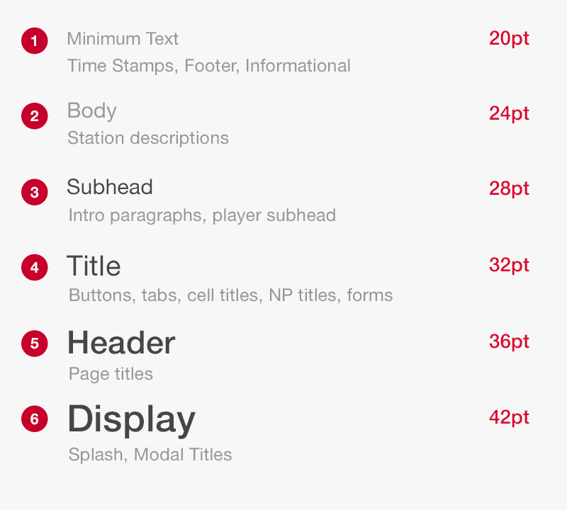
iHeartRadio
Web Type:
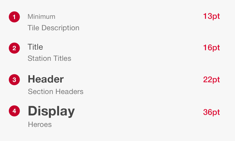
iHeartRadio
You can also try out the type tool from Jeremy Church.
Typefaces
The typefaces, we use to design our website, can be categorized under serif, sans-serif and cursive.
Sans-Serif typefaces
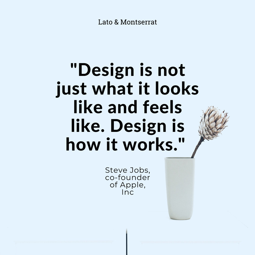
Use sans-serif typefaces in headings, subtitles, buttons:
- Arial
- Avenir
- Futura
- Helvetica
- Lato
- Montserrat
- Open Sans
Fonts used in larger sizes are also called „Display Fonts“.
.
Serif typeface
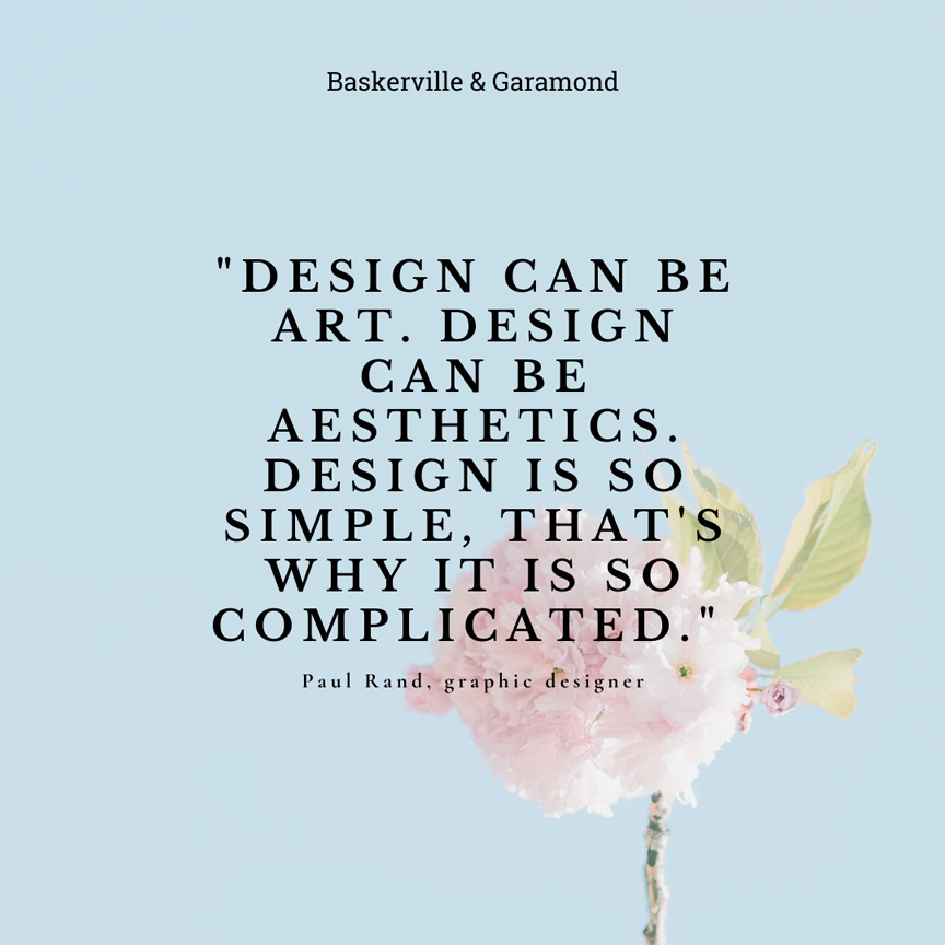
Serif typefaces are easily readable when written in small body sizes and therefore used in body text. Serif typefaces are popular to use on screens, such as websites and blogs.
- Garamond
- Baskerville
- Palatino
- Times New Roman
- Rockwell
- Allegro
.
Large Font families
Large families like „Roboto“ make branding easier if you plan a long-term project because you need to handle different situations like f.ex., writing a Newsletter or Blog, planning a marketing campaign or creating a logo. You can use the variety of the font in using different weight, a condensed version end more.
- Alegreya
- Roboto
- Nunito
- Merriweather
.
If you still don’t know which font you should choose, think about what you want to communicate with your brand. Who is your target audience? Read other articles like Google’s Beginners Guide about choosing web fonts or Canva’s Guide to font pairing.
I hope you enjoyed reading this article and it could help you choose the right typography for your web project.

